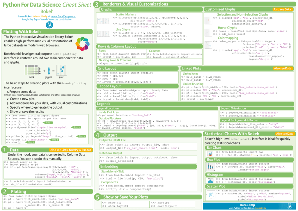
Python Bokeh is a powerful data visualization library that enables creation of interactive and web-ready plots with ease. It offers seamless integration with Python’s data ecosystem and empowers users to craft captivating visualizations tailored for exploratory data analysis. This cheat sheet serves as a refresher for people who are new to or intermediate in using Python Bokeh. Utilize it to visualize big datasets interactively.
Table of Contents
Introduction
In the realm of data visualization, Python’s Bokeh library stands out as a powerful tool for creating interactive and web-ready plots. Whether you’re working with large datasets or complex visualizations, Bokeh offers a seamless and efficient way to explore your data. This cheat sheet is designed to be your trusty companion, providing a quick reference to the essential features and functionalities of Bokeh.
What is Bokeh?
Bokeh is a Python library that empowers data scientists and analysts to create interactive and sophisticated visualizations. Unlike other plotting libraries, it doesn’t stop at static plots; it allows you to build interactive plots that can be exported as HTML files. Here are some key features:
- Interactive Tools and Widgets: It provides tools and widgets that allow you and your audience to explore data interactively. You can probe “what if” scenarios, drill down into details, and dynamically adjust visualizations.
- Shareable Plots and Dashboards: Create plots, dashboards, and apps that can be published on web pages or embedded in Jupyter notebooks. It makes it easy to share your insights with others.
- Python-Centric: It integrates seamlessly with popular Python libraries such as NumPy, SciPy, Pandas, Dask, Scikit-Learn, and OpenCV. You can leverage your existing Python skills to create compelling visualizations.
- Powerful Customization: While it provides common plot types out of the box, you can also add custom JavaScript to handle specialized use cases.
- Open Source: Everything in it, including the Bokeh server, is BSD licensed and available on GitHub.
Bokeh: Few Essential Features (Code)
1. Bokeh Basics
from bokeh.plotting import figure, output_file, show

# Create a new plot
p = figure(title="My Plot", x_axis_label="X", y_axis_label="Y")

# Add glyphs (markers, lines, etc.)
p.scatter([1, 2, 3], [4, 5, 6], size=10, color="navy", alpha=0.5)
# Save to file or show in notebook
output_file("plot.html")
show(p)
2. Layouts
from bokeh.layouts import row, column
from bokeh.plotting import figure

x = list(range(11))
y0 = x
y1 = [10 - i for i in x]
y2 = [abs(i - 5) for i in x]
y3 = [abs(i - 3) for i in x]

# create three plots
p1 = figure(width=250, height=250, background_fill_color="#fafafa")
p1.circle(x, y0, size=12, color="#53777a", alpha=0.8)

p2 = figure(width=250, height=250, background_fill_color="#fafafa")
p2.triangle(x, y1, size=12, color="#c02942", alpha=0.8)

p3 = figure(width=250, height=250, background_fill_color="#fafafa")
p3.square(x, y2, size=12, color="#d95b43", alpha=0.8)

p4 = figure(width=250, height=250, background_fill_color="#fafafa")
p4.square(x, y3, size=12, color="#d94352", alpha=0.8)

# Arrange plots in a row or column
row_layout = row(p1, p2)
col_layout = column(p3, p4)
# Combine layouts
layout = row(row_layout, col_layout)
show(layout)
3. Widgets
from bokeh.layouts import column, row
from bokeh.models import ColumnDataSource, CustomJS, Slider
from bokeh.plotting import figure, show
import numpy as np

x = np.linspace(1, 15, 500)
y = np.cos(x)

source = ColumnDataSource(data=dict(x=x, y=y))

plot = figure(y_range=(-20, 20), width=600, height=400)

plot.line('x', 'y', source=source, line_width=4, line_alpha=0.6)

plot_amplitude = Slider(start=0.1, end=20, value=5, step=.1, title="Amplitude")
plot_frequency = Slider(start=0.1, end=20, value=5, step=.1, title="Frequency")
plot_phase = Slider(start=-5, end=5, value=0, step=.1, title="Phase")
plot_offset = Slider(start=-10, end=10, value=0, step=.1, title="Offset")

callback = CustomJS(args=dict(source=source, plot_amplitude=plot_amplitude, plot_frequency=plot_frequency, plot_phase=plot_phase, plot_offset=plot_offset),
                    code="""
    const A = plot_amplitude.value
    const k = plot_frequency.value
    const phi = plot_phase.value
    const B = plot_offset.value

    const x = source.data.x
    const y = Array.from(x, (x) => B + A*Math.cos(k*x+phi))
    source.data = { x, y }
""")

plot_amplitude.js_on_change('value', callback)
plot_frequency.js_on_change('value', callback)
plot_phase.js_on_change('value', callback)
plot_offset.js_on_change('value', callback)

show(row(plot, column(plot_amplitude, plot_frequency, plot_phase, plot_offset)))
4. Exporting and Embedding
from bokeh.resources import CDN
from bokeh.embed import file_html,components
plot = figure()
plot.circle([1,2], [3,4])

# Export plot as HTML
html = file_html(plot, CDN, "my_plot")
# Embed plot in web application
script, div = components(plot)
Bokeh Common Use Cases
Bokeh is versatile and can be applied in various scenarios:
- Applications: Build data-driven applications with rich visualizations.
- Dashboards: Create interactive dashboards for monitoring and decision-making.
- Exploration: Explore data interactively during analysis.
- Streaming: Visualize streaming data in real time.
- Websites: Enhance web pages with dynamic visual content.
User Showcase
Here are some projects that showcase Bokeh’s capabilities:
- Dask: A tool for scaling out PyData projects like NumPy, Pandas, Scikit-Learn, and RAPIDS. The Dask Dashboard, powered by Bokeh, helps monitor and debug live cluster performance.
- Microscopium: Researchers at Monash University uses it to explore large image datasets, discovering new gene or drug functions.
- Panel: A polished data presentation tool that utilizes its server. It simplifies creating custom interactive web apps and dashboards by connecting user-defined widgets to plots, images, tables, or text.
- Chartify: Built by Spotify, Chartify offers an opinionated high-level charting API on top of it. It focuses on smart defaults, tidy data format, and simplicity.
- Mistic: A Python software package using it for simultaneous visualization of multiplexed 2D images, aiding researchers in exploring complex datasets.
- ArviZ: A community-led package for Bayesian model analysis. It provides backend-agnostic tools for diagnostics and visualizations of Bayesian inference.
Bokeh Cheat Sheet

Summary
Bokeh’s powerful features and interactive capabilities make it an essential tool for data visualization. With this cheat sheet at your fingertips, you’ll be able to quickly create stunning and interactive visualizations, unlocking new insights and telling compelling data stories. With Bokeh, your data can come alive in the browser, bridging the gap between Python and beautiful, interactive visualizations!
Learn more about machine learning and other topics
- Machine Learning: All in One Ultimate Cheat Sheet
- Learn Bokeh on its Official website
- The Ultimate Cheat Sheet for Deep Learning
- Cloud Load Balancing: How To Choose?
- AWS Redshift Vs Snowflake: How To Choose?
- NoSQL Vs SQL Databases: An Ultimate Guide To Choose
